Canonical
on 6 August 2013
Over the past few weeks we’ve been exploring visual directions for the calendar app. It’s a pretty exciting opportunity to create something fresh and at the same time useful. In this post I’ll take you through some of the directions we’re looking at right now and where we hope to eventually go. At this stage the designs are still under consideration.
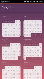
Year view
This view offers a lot of challenges particularly given the large amount of information that can be compacted into such a small space. The challenge was to provide something that could inform the user quickly and usefully without overloading the screen with information. Each month is clickable. Individual dates, however, will need to be selected from the month view.
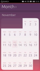
Month view
As with year view, it’s a tough call to keep the month view looking and feeling smooth and simple. Because of this, we decided to use the month view to provide the user with an overview of the dates in that month, from which they could select a date only. Instead of filling in the events inside the month view, the user can see the events at a glance inside the week view. We explored two different ways of laying out the month view visually.

Week view
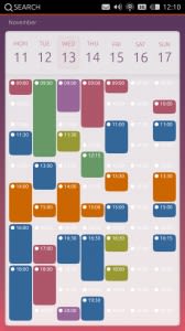
In this view we experimented with the visual layout in terms of how much screen space the chrome took up and how you could visually represent different calendar events using coloured blocks vs coloured dots.
Day view
With day view, as with Week view, we tried looking at reducing the chrome around the day box to give more space to what the user most needs to see – the events during that day.
Event
Event view tends to be a different interface type than the others. Where with the other views a user’s prime activity is to navigate through information, the event is the goal in itself, providing a list of information. Because of this, a white background may be a better solution to presenting large amounts of text, making it easier on the eye. One thing that is still in design at the moment is the ability to select the date and time when creating a new event.
We hope you enjoyed going through our visuals and thought process. Watch this space next time for more visuals on date and time picker to go along with event view.
Video
Here’s a video to show how the interactions and transitions will eventually function.

